
My Top 23 Weddings of 2023
- Jessica Giovine
- Jan 29, 2024
- 16 min read

Updated: Jan 30, 2024
I did exactly 100 weddings in 2023, and what a year it was! To say that it was extremely difficult to highlight only 23 of them here would be a massive understatement. I'm also still waiting on tons of galleries from last year — to all my couples: please please share when you can!
Without further ado, let's check out my favorites (in no particular order)!
Catherine & Bennett: Bienvenue à Paris!


The Venue: Hôtel Le Marois - Paris, France
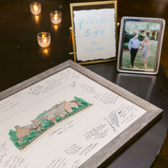
What I Did: This entire wedding was gold and sage green. For the invitation suite, I used gold foil for their names, created a custom hand painted map using their colors, used nude chiffon ribbon for texture, and a sage green wax seal of the Eiffel Tower (that was shipped to me directly from Paris). I hand painted each Eiffel Tower in gold — super epic. For day of signage, I created menu cards that matched the invitation suite. For the seating chart, Catherine found these really cute little locks in the spirit of the Pont des Arts, the famous Love Lock Bridge in Paris. Favors were baguettes, and I made stickers that said “the best thing since sliced bread.” The opulence of this ballroom was like not even real. Her dress, the bow — AH! This couple was lovely and so fun to work with. Everything just made sense and could not have been planned out better.
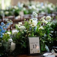
Rachel & Alex: Waterfront Floral


The Venue: Clarks Landing Yacht Club - Point Pleasant, NJ
What I Did: This couple wanted to feature their blue and white florals. The seating chart was literally an incredible flower box — I printed all of the place cards, and Diane placed them in. I have always wanted someone to do this, and I was so thrilled that they did. Paired it with an acrylic sign in their colors. Consistency without being matchy-matchy. For the invitation suite, we used gold foil and a deep dusty blue envelope with my watercolor of Clark’s Landing in the liner. Programs and Menus featured the same look. Sea glass table numbers with wood stand to tie in the wood flower box seating chart. Signature Cocktail sign was clear acrylic with blue lettering.
Kara & Rob: Floral Fairytale


The Venue: The Ashford Estate - Allentown, NJ
What I Did: One of the most colorful weddings I’ve ever done. Kara wanted to showcase all the color. This invitation suite featured super bright pinks, mauve, maroon with gold foil printing — dusty rose ribbon — gold wax seal for added texture. Sort of a play on Beauty and the Beast—but understated, not in your face. Programs and menus tied into invitations — very cohesive. The closhes as part of the seating chart came out so awesome — using the dark green and pinks made the white lettering pop. “Let’s jam with the Jamesons” sign next to the maracas and tambourines. “Be Our Guest” sign to highlight the closhes. Clear acrylic sign for signature cocktails featured the "Jameson" Mule, which tied in their last name. Wedding was supposed to be outside, but it poured so everything got moved to the barn (I think the barn is even more pretty!)
Lauren & Adam: Modern New York City


The Venue: Tribeca Rooftop - New York, NY
What I Did: For invitations, I used all letterpress featuring white with navy blue, vellum for the bellyband, and a map of NYC on shimmer paper. I designed their custom monogram which made it onto the doors of Tribeca Rooftop which is so freaking cool and made me so excited! I went with printed materials for signature cocktails sign with a light map of the city in the background. Super chic and tied in gold as an accent color. Same with the menu cards. Chuppah was acrylic — super modern — fit the very modern venue. Gold acrylic table numbers were actually a rental of mine. Carried monogram through every aspect — even the napkins. Cohesive and elevated. Booking this venue was super exciting for me!
Ellen & Patrick: Rustic Elegance


The Venue: The Ryland Inn in the Coach House
What I Did: This wedding was unique in that it was a rustic venue but we didn't want to have to just do wood. I wanted to incorporate different elements without it being all wood. I created a mirror for the seating chart — and the layered florals were incredible. Clean and classic with rustic undertones. The couple rented one of my copper stands for their white acrylic welcome sign. Modern but still rustic ties with the pavers behind it. The invitation suite was pink — with my watercolor of the coach house on both the invitation and menu. Very elegant.
Vendors: Molly Sue Photography, Jardiniere Florals
Stacie & Sean: Old Hollywood / Cigar Bar


The Venue: Nauvoo Grill Club - Rumson, NJ
What I Did: This was my best friend’s wedding, and I was actually the Maid of Honor! The vibe of this wedding was very different from the rest — very moody. The fireplace — oh my god. It was an intimate wedding — about 60 people. Looks like a cigar bar — very Stace—totally their vibe. Main colors were copper and rose gold. Letterpress on the entire invitation suite on nice thick cotton paper. Copper foil with black letterpress — names were in foil. Monogram — black bellyband and black envelope with copper liner — so good, chef’s kiss! Menus I kept same vibe, carrying monogram through and same colors. The — you can see through it kind of like a vellum. It was so chic and super modern. Used copper lettering — same for welcome sign (my Copper stand rental). One of my favorite florists to work with, hands down. The fireplace was decked out in florals. Signature cocktails with Copper frame with their dogs — so cute — and they were the best cocktails I’ve ever had — not even exaggerating. Best food I’ve ever had at a wedding — not just saying that either. One of the best weddings I've ever been to — music was top notch — everything was absolutely perfect.
Vendors: Oceans to Mountains Photo, Three Girls Floral
Michelle & Paul: Historic Philadelphia


The Venue: The Union League - Philadelphia, PA
What I Did: This venue is so freakin' good — so much history. This wedding was all acrylic. Invitations featured a painting of the Union League — one of my favorites that I’ve ever done. Detail color was navy blue for everything. Wanted to bring in some modern elements even though it’s so historical. Vellum to hold everything together for modern flair with navy blue envelope. Menu cards same — only made sense. Creating circular acrylic signs was so exciting — had only done it once before. The seating chart was comprised of 3 different size acrylic pieces because of the size of the table — best ways to fit it without going horizontal — wanted to keep the height. I painted their Corgis on the signature cocktail signs. This was one of my first weddings in 2023, and it started with such a bang. So happy to be part of it, can’t even put it into words.
Vendors: We Laugh We Love Photography, Beautiful Blooms
Katherine & Dan: Textured Country Club


The Venue: Fiddler’s Elbow Country Club - Bedminster, NJ
What I Did: I used my painting for the invitations, which featured dusty blue and light sage greens. Welcome bag had an itinerary card and timeline. Rehearsal dinner info included in some of the invitations. I used deckled paper for the signage — and gave it a modern flair by putting it behind acrylic. Killed it — brought it to a different level providing dimension and texture. Looked incredible in front of the clock. For small signage I worked in a gold accent color. Signature cocktails signage had a watercolor theme like venue painting. Place cards were watercolor dusty blue with gold calligraphy. Small signs same. For the guestbook, they used my original watercolor and guests got to sign it — so good!
Danielle & Jordan: Farm Floral


The Venue: Crossed Keys Estate - Andover, NJ
What I Did: I just noticed that the welcome sign has a ladybug on it which is literally the coolest thing ever — and good luck! Crossed Keys is hands down my favorite venue in the entire state of New Jersey. You’re still on a farm, but they just added a conservatory which is absolutely to die for. It’s very modern compared to the ballroom which is more rustic, and the ceremony spot which is on the farm. For the invitation suite, I used deckled paper with a rustic-ish watercolor of Crossed Keys Estate — tied together by a chiffon nude ribbon with a wax seal. Cute details card paired with a light green envelope. The acrylic welcome sign takes it to another level. Venue painting on the matchbox for the cigar bar. Seating chart is one of my all — even though it’s just vases, the texture and tying in the terracotta took it to another level — used deckled paper and wax seal. Literally every single thing was so cohesive I can’t even take it — I loved it so much. I met with Danielle in person in my studio and I have a vase seating chart for reference, and she saw it and fell in love with it. Tied in menus with watercolor, flowers were to die for — every aspect was just perfection. So freakin’ good.
Emma & Paul: Retro Bowling Alley


The Venue: Asbury Lanes - Asbury Park, NJ
What I Did: A certain famous local singer was in attendance and performed at this wedding! The seating chart was a custom built structure done by one of my woodworkers — 8’ x 6’ printed giant acrylic. I was onsite the day of to see it hung, and it was insane. Three Girls Floral put together everything behind. This wedding was sick — the ceremony was at the Asbury Hotel, and the reception at Asbury Lanes. Such a cool venue — look at the walls — insane — I literally can’t. For the invitations, I used deckled paper with pink accents — tied in some modernnn with printed vellum with a wax seal — literally could. not. have. been. cooler. Signage very simple — thick paper printed. One of the best weddings I’ve ever been a part of in every single way.
Vendors: Christina Lily and Elisabeth Lindefjeld, Three Girls Floral, Nicole and Amanda of NEOccasion
Alyssa & Corey: Artistic Opulence


The Venue: The Park Savoy - Florham Park, NJ
What I Did: Entire vibe was opulence and antique-y. Everything modeled off of the Dutch masters paintings. For invitations, I used deckled paper — handmade like Dutch masters. Opulent frame letterpressed in with names in foil. Rest of the invitation suite in deckled paper with same coherent vibe. Envelope liner was a legally-obtained Dutch masters painting. Tied it together with a nude ribbon and an antique gold wax seal — absolutely stunning . Flowers were absolutely friggin’ to die for. Telephone booth guest book — antique mirrors inside — carried it along for all of the smaller signs. The seating chart was so cool. They built structure to match Park Savoy trim (shoutout to Alyssa’s mom — the sweetest ever) with antique mirrors they found throughout New Jersey. I hand lettered on all of the mirrors. Each one has a Dutch masters painting printed with acrylic overlaid for me to write on. Literally how fucking cool is that?! Ahhhh! Absolutely a top 5 seating chart for me in 2023. Kept the same vibe for program, menu, and table numbers — opulent frame around it all to keep everything cohesive.
Vendors: Drzazga Photo, Lady Slipper Posy
Gabbi & Tom: Salem Museum


The Venue: Peabody Essex Museum - Salem, MA
What I Did: Gabbi is a wedding planner I work with a lot. They got married in a museum — the first one I’ve worked on — how freakin’ cool is that?! They got married around Halloween — whole theme was upscale Halloween (not gothic). White flowers with dark maroon accents. Black frames on everything. Every table had black and white photos of them from their engagement shoot. Their signature drink was a G&T (get it? Gabbi & Tom!). Menus were so gorg — arched with their G&T monogram that I created for them with vellum tying in the modern. They also did a guest book phone recording. Like are you kidding me — Salem. In a museum. Around Halloween. So cool!
Stacey & Jaycee: Bright and Colorful Concert


The Venue: The Ho-Ho-Kus Inn & Tavern - Ho-Ho-Kus, NJ
What I Did: This wedding was very very very cool. Only about 50 guests — luncheon reception during the day outdoors at Ho-Ho-Kus Inn & Tavern. Then they went to the Zac Brown Band concert after — everyone went — like how freakin’ cool?! For invitations — Stacey wanted to make this very playful — as you can see the monogram is so playful. Florals were incredible — so much pink and orange. Watercolor for the vibe — opal shimmer paper — same with the envelope. Satin pink/peach ribbon. I designed a cute map of New Jersey with their favorite spots to eat in North Jersey. Every single aspect of this wedding was tied to Zac Brown Band lyrics. I made them custom vow books. Menus matched the invitation — ombré pink to orange — names on the napkin. Super cute bar cart with menu on frosted acrylic and signature cocktails. Frosted made sense with the shimmer. Lyrics to the song "Family Table" written on fabric to hang from their table, “This family table is bound together by a love that never dies.” So cool! They even brought a sign to the concert — "Pour me another one, make it a strong one we’re gonna have some fun tonight." In church their son carried a wooden sign down the aisle — so cute. Every aspect was very thought out — some of the coolest items that I’ve ever created!
Vendors: Amanda Bonneau Photography, Laurelwood Designs
Kristin & Tom: Modern and Meticulous


The Venue: Hudson House - Jersey City, NJ
What I Did: Invitation suite featured a map of Hoboken and Jersey City highlighting their home, the Church they got married at, Hudson House (where the reception was), The W (where everyone was staying), and the Statue of Liberty. I created their monogram which we tied into everything. Hudson House is super modern — everything is lined in glass all around, so we really played with the acrylic. They rented my silver acrylic table numbers, and tied in the blue for the pop of color for the menus. Acrylic welcome sign and signature cocktails sign. Linens were brought in with a gorgeous blue pattern in addition to the blue patterned napkins. Modern but also traditional — everything was meticulously thought out which I loved.
Vendors: Louise Conover, A Touch of Elegance, Kateade Events
Dani & Drew: Industrial Farm Chic


The Venue: Crossed Keys Estate - Andover, NJ
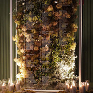
What I Did: Definitely one of my favorite weddings of 2023. I pulled in color and leaned into the garden party theme. All of the bridesmaids had different color dresses in a low key garden-y vibe. Invitations all letterpress — neutral with a light gray print — very organic. Organic envelope liner and timeline cards showed everything for the day. One of the coolest seating charts I’ve EVER done (and also one of the most stressful). Every single thing was pressed florals, but black was a big accent color — giving an industrial vibe. Found the dividers for the seating chart online, and I painted them solid white. I then custom cut acrylic to the size of the inside panels. I pressed flowers on every single one. Calligraphy on the others for the guest names, and then adhered them to the dividers. It was an incredible statement piece. Black trim frame for signature cocktails, table numbers, and photo/video printed signage. Letterpress menus with a pressed flower on every single one. Vellum place card with satin ribbon attached to it. This wedding was insane!
Jillian & Chris: Modern Watercolor


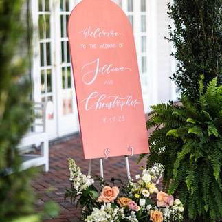


The Venue: Bonnet Island Estate - Manahawkin, NJ
What I Did: This one was quite different than other Bonnet Island weddings I did in 2023. This color scheme went in a totally different direction than the usual blue. Pinks, peaches, and terracotta were huge for Jillian. Invitations were a very modern take with whimsicality in the font — tying in a nude details card, terracotta envelope, and a light pink vellum — ahhh so good! For the rest of the wedding, I tied in gold as an accent color, but everything else was a watercolor ombré (from pink to orange down to the terracotta) for the signature cocktails, table numbers, and photo guestbook. Same for the seating chart, which I hand painted everything in a different color to make it ombre — AH it was SO good! To be different, we did an arched terracotta welcome sign that was just chef’s kiss. Beach-friendly, but not blue and white in-your-face typical beach wedding vibe.
Katie & Dave: Black Tie Estate


The Venue: Shadowbrook - Shrewsbury, NJ
What I Did: This. Invitation. I printed the gates of Shadowbrook on a vellum jacket with a key on the gold wax seal. So freakin’ cool. I included my Shadowbrook watercolor on the details card. The entire suite was on gorgeous cotton paper, featuring letterpress with gold foil for their names to tie in the gold wax seal. Envelope liner was a stunning opal shimmer. I wanted to keep the invitations as clean and classic as possible because of how much was going on with the jacket. So good — so freakin’ good! The welcome sign worked with the look of the invitation. For the seating chart, the couple rented my big white stand and I did all black acrylic and all black acrylic with the table numbers, which tied nicely to the black and gold color scheme of the venue.
Vendors: Molly Sue Photography, Anna’s Flowers & Gifts
Kelly & Ben: Neutral Beachfront


The Venue: Windows on the Water - Sea Bright, NJ
What I Did: Although their map was one of the coolest ever, this one was really all about the seating chart. I get a ton of positive feedback and inquiries about these beach badge seating charts. I did a few in 2023, but I loved this one because it was just so pretty. I included the venue painting on the badges, which I think is awesome. This wedding was my only one where they were actually married ON the beach, which was really cool. For the invitations, I did the watercolor of the venue, as well as the map which had the locations of all things happening for their wedding weekend. I used deckled paper, which was so amazing and also tied in the beach vibes. I used wood frames for day of signage, and watercolor for their featured cocktails (which included their pup). To tie in the beachy vibe, we used wood for the welcome sign and I stained it with a driftwood color (which was a layering process). Such a sweet couple — such a great wedding!
Vendors: Jac and Jules, PeterJames Floral Couture
Cassandra & Matt: Beachy and Blue


The Venue: Clarks Landing Yacht Club - Point Pleasant, NJ
What I Did: This wedding was sick. I’ve received countless inquiries about the painted Champagne bottles. So cool. I created the couples’ monogram, which we tied into everything (even their ice sculpture!). For the invitations, I did blind embossing (when you letterpress into the paper but there’s no ink). So sick. We went with a whimsical wavy formal font which ties in the beachy vibe. The mirror seating chart also had their monogram at the top. For the rest of the day of signage, I did dusty blue painted brushstrokes on the back of acrylic (signature cocktails, guest book, in loving memory, head table sign, and table numbers). The monogram made it on the matchbooks, menus, and even the cake! Check out that ice sculpture — so cool!
Vendors: KiaMarie Stone, Narcissus Florals, Chocolate Carousel
Gina & Charles: Classic Christmas


The Venue: The Park Savoy - Florham Park, NJ
What I Did: This was a Christmas wedding which was so cool! For their invitations, I did a brand new painting of the chapel at The Park Savoy. Their seating chart was siiiiick. It was 4’x6’ and I designed it on the computer and printed it on a huge vinyl piece that I adhered to a giant piece of wood, and then laser cut “To All A Good Night” at the top. It made such an incredible statement. The Christmas vibe of this wedding was just so good.
Vendors: Kaitlin Noel, A Creative Touch
Natalie & Joe: Coastal Cape May


The Venue: Congress Hall - Cape May, NJ
What I Did: Congress Hall is one of my favorite places to go in the world, which naturally made working on this wedding one of my favorites in 2023. My husband Nick and I visit Congress Hall every year, so this was really special. For the invitations, I used my painting of Congress Hall tied in with a dusty blue and peach (since blue and copper were their entire vibe for the wedding). This couple got married in the same church that my parents renewed their vows in, so it meant a lot to me to work on this one. The inside of Congress Hall is super cool and very historic (which the couple made sure to highlight). I tied in watercolor for the table numbers with copper frames. The individual place cards had oyster shells sitting on top. The rest of the day of signage was dusty blue acrylic. And my seating chart — ahhh it was so freakin’ cool, I loved it. My copper stands with the dusty blue printed. I can’t.
Vendors: Rachel Pearlman, Jennifer Designs, Blank Slate Events
Maggie & John: Heaven in The Hamptons


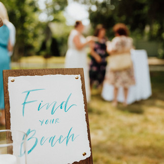


The Venue: Shelter Island Private Estate - Shelter Island, NY
What I Did: I was actually at this wedding (this was my husband's cousin's wedding)! Shelter Island is literally one of the most beautiful places. Ever. I fell in love with it and I cannot wait to go back. The wedding was at the family’s home which had been passed down for decades. The backyard was GIANT — perfect for tenting a wedding. Oysters were a big part of this wedding — and they were the best oysters I’ve ever had (even better than NOLA). For their invitations, I included the oysters at the top. All of their flowers were blue and white Hydrangeas, so I also tied that in. We kept it simple and just did one card with jute tied around it to bring in the beach vibe. Since the wedding was in the backyard, we wanted to tie in the neutrals of the trees (there were trees everywhere). I did a light stained wood for the welcome sign, timeline sign, and all of the table signs (which were named after beaches on Shelter Island — these were my fave). For the seating chart, I did oyster shells that were hand painted gold and white, with the names in dark blue. The “Find Your Beach” sign that went with it was blue calligraphy on deckled paper to break it up a bit since there were already 2 large wood signs. I loved this wedding because everything they used was local. The candles, the driftwood, the oyster shuckers. It was absolutely beautiful.
Vendors: HJPhotoCo.
Nicole & Anthony: Lakeside in Lake George


The Venue: The Sagamore Resort - Lake George, NY
What I Did: Nicole is actually my assistant (she’s the best). Her wedding was in Lake George (one of 2 I had there in 2023). We didn’t focus on signage, so this was more of a stationery wedding. I hand drew The Sagamore Resort and letterpressed it in. I did their names in gold foil as an accent color, and paired it with a dark emerald green pocket. When you turned it over, it had the details of the day (since it was a destination for everyone). We included a QR code RSVP card as well in the same look. For the menus, I kept everything consistent with the same fonts, and then I pressed The Sagamore into the emerald green wax seals — ahhh so good! The views on the lake were amazing, like are you kidding?!
Vendors: Courtney Simpson Photo
BONUS: Maura & Mike: Yacht Club

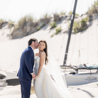


The Venue: ICONA Avalon - Avalon, NJ
What I Did: I did all of their stationery — from their save the dates to their invitation suite — and kept everything very cohesive. Avalon is such an amazing area, and we wanted to highlight that with the custom map that outlined all of the weekend’s events. Everything for this suite was dusty blue, which tied into the beach and sailboat vibes. It was super organic and watercolor-y, and it turned out beautifully just like their wedding!
Vendors: Kaitlin Noel Photography